Plot 图表绘制
何时使用
建立在d3.js和stack.gl,Plotly.js是一个高级的声明性图表库。
- 快速使用plotly.js 提供的 40 多种图表类型,包括 3D 图表、统计图表和 SVG 地图;
- 当有大量的基本、统计、科学、财务、地图、3d和动画数据图表需要展现时。
代码演示
危险
Errantia 组件不包含 plotly.js 任何库和包的内容, 使用plotly.js 能力需要提前在自己项目引入plotly.js, 不然Plot 图表绘制组件将无法正常工作,引入方式参考ploty官网, NPM方式执行:npm i --save plotly.js-dist-min 即可.
基本与统计图表
代码
<template>
<erFlex>
<div style="width: 400px; height: 300px;">
<erPlot
:dataSource="data"
:layout="layout"
/>
</div>
<div style="width: 500px; height: 300px;">
<erPlot
:dataSource="data1"
:xaxis="{title: '折线和散点图', zeroline: true, showline: true, mirror: false }"
:yaxis="{zeroline: true, showline: true, mirror: false}"
:margin="{b: 40}"
/>
</div>
<div style="width: 400px; height: 300px;">
<erPlot
:dataSource="data2"
:layout="layout2"
:margin="{l: 40}"
/>
</div>
</erFlex>
</template>
<script setup lang="ts">
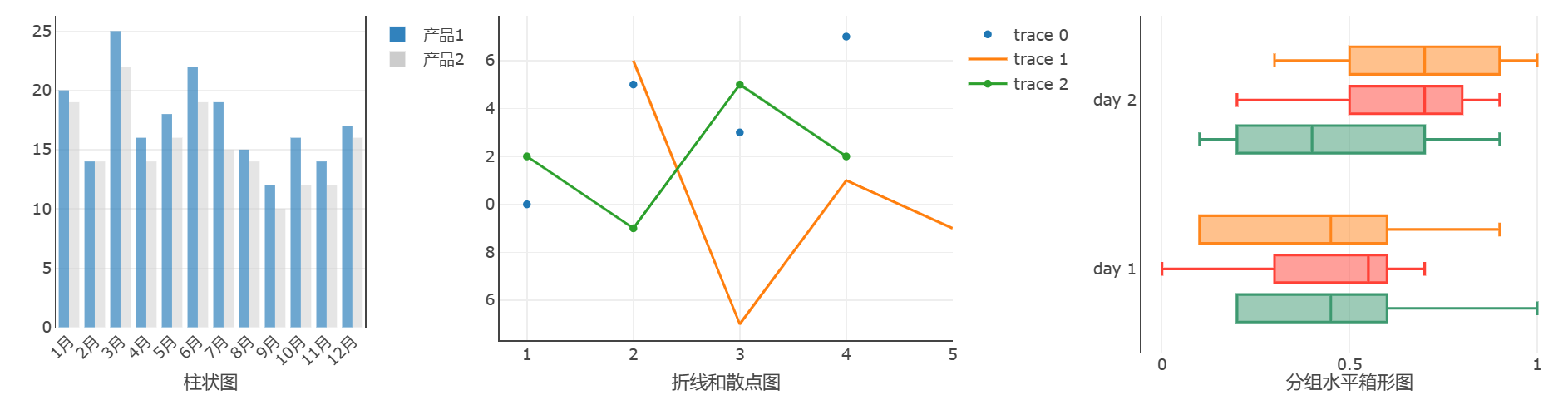
// 柱状图数据区域
const data = [
{
x: ['1月', '2月', '3月', '4月', '5月', '6月', '7月', '8月', '9月', '10月', '11月', '12月'],
y: [20, 14, 25, 16, 18, 22, 19, 15, 12, 16, 14, 17],
type: 'bar',
name: '产品1',
marker: {
color: 'rgb(49,130,189)',
opacity: 0.7,
}
},
{
x: ['1月', '2月', '3月', '4月', '5月', '6月', '7月', '8月', '9月', '10月', '11月', '12月'],
y: [19, 14, 22, 14, 16, 19, 15, 14, 10, 12, 12, 16],
type: 'bar',
name: '产品2',
marker: {
color: 'rgb(204,204,204)',
opacity: 0.5
}
}
];
const layout = {
xaxis: {
title: '柱状图',
tickangle: -45
},
margin: {
l: 40,
r: 10,
b: 50,
t: 10,
},
barmode: 'group'
};
// 折线与散点数据区域
const data1 = [
{
x: [1, 2, 3, 4],
y: [10, 15, 13, 17],
mode: 'markers',
type: 'scatter'
},
{
x: [2, 3, 4, 5],
y: [16, 5, 11, 9],
mode: 'lines',
type: 'scatter'
},
{
x: [1, 2, 3, 4],
y: [12, 9, 15, 12],
mode: 'lines+markers',
type: 'scatter'
}
];
// 箱型图数据区域
const y = [
'day 1', 'day 1', 'day 1', 'day 1', 'day 1', 'day 1',
'day 2', 'day 2', 'day 2', 'day 2', 'day 2', 'day 2'
]
const data2 = [
{
x: [0.2, 0.2, 0.6, 1.0, 0.5, 0.4, 0.2, 0.7, 0.9, 0.1, 0.5, 0.3],
y: y,
name: 'kale',
marker: {color: '#3D9970'},
type: 'box',
boxmean: false,
orientation: 'h'
},
{
x: [0.6, 0.7, 0.3, 0.6, 0.0, 0.5, 0.7, 0.9, 0.5, 0.8, 0.7, 0.2],
y: y,
name: 'radishes',
marker: {color: '#FF4136'},
type: 'box',
boxmean: false,
orientation: 'h'
},
{
x: [0.1, 0.3, 0.1, 0.9, 0.6, 0.6, 0.9, 1.0, 0.3, 0.6, 0.8, 0.5],
y: y,
name: 'carrots',
marker: {color: '#FF851B'},
type: 'box',
boxmean: false,
orientation: 'h'
}
];
const layout2 = {
xaxis: {
title: '分组水平箱形图',
zeroline: false,
showline: false,
},
yaxis: {
zeroline: true,
showline: true,
mirror: false
},
boxmode: 'group',
showlegend: false,
};
</script>
科学与3D图表
代码
<template>
  <erFlex>
    <div style="width: 450px; height: 300px;">
      <erPlot
        :dataSource="data"
        :xaxis="{title: '简单等值线图'}"
        :margin="{b: 40, l:30}"
      />
    </div>
    <div style="width: 400px; height: 300px;">
      <erPlot
        :dataSource="[{
            z: [[1, 20, 30], [20, 1, 60], [30, 60, 1]],
            type: 'heatmap'
        }]"
        :xaxis="{title: '基本热图' }"
        :margin="{l: 30, b: 40}"
      />
    </div>
    <div style="width: 400px; height: 300px;">
      <erPlot
        :dataSource="data2"
        :margin="{l: 40, b: 30}"
      />
      <div style="margin-left: 140px; margin-top: -18px; position: fixed;">3d图表</div>
    </div>
  </erFlex>
</template>
<script setup lang="ts">
  // 等线数据区域
  const size = 100;
  let x = new Array(size);
  let y = new Array(size);
  let z = new Array(size);
  let i = undefined;
  let j = undefined;
  for(i = 0; i < size; i++) {
    x[i] = y[i] = -2 * Math.PI + 4 * Math.PI * i / size;
      z[i] = new Array(size);
  }
  for(i = 0; i < size; i++) {
      for(j = 0; j < size; j++) {
        var r2 = x[i]*x[i] + y[j]*y[j];
        z[i][j] = Math.sin(x[i]) * Math.cos(y[j]) * Math.sin(r2) / Math.log(r2+1);
    }
  }
  const data = [{
      z: z,
      x: x,
      y: y,
      type: 'contour'
    }
  ];
  // 3D数据区域
  const z1 = [
      [8.83,8.89,8.81,8.87,8.9,8.87],
      [8.89,8.94,8.85,8.94,8.96,8.92],
      [8.84,8.9,8.82,8.92,8.93,8.91],
      [8.79,8.85,8.79,8.9,8.94,8.92],
      [8.79,8.88,8.81,8.9,8.95,8.92],
      [8.8,8.82,8.78,8.91,8.94,8.92],
      [8.75,8.78,8.77,8.91,8.95,8.92],
      [8.8,8.8,8.77,8.91,8.95,8.94],
      [8.74,8.81,8.76,8.93,8.98,8.99],
      [8.89,8.99,8.92,9.1,9.13,9.11],
      [8.97,8.97,8.91,9.09,9.11,9.11],
      [9.04,9.08,9.05,9.25,9.28,9.27],
      [9,9.01,9,9.2,9.23,9.2],
      [8.99,8.99,8.98,9.18,9.2,9.19],
      [8.93,8.97,8.97,9.18,9.2,9.18]
  ];
  const z2 = [];
  const z3 = []
  {
    let i = undefined;
    let j = undefined;
    for (i=0;i<z1.length;i++ ) {
      let z2_row = [];
        for(j=0;j<z1[i].length;j++) {
          z2_row.push(z1[i][j]+1);
        }
        z2.push(z2_row);
    }
    for ( i=0;i<z1.length;i++ ) {
      let z3_row = [];
        for( j=0;j<z1[i].length;j++) {
          z3_row.push(z1[i][j]-1);
        }
        z3.push(z3_row);
    }
  }
  const data_z1 = {z: z1, type: 'surface'};
  const data_z2 = {z: z2, showscale: false, opacity:0.9, type: 'surface'};
  const data_z3 = {z: z3, showscale: false, opacity:0.9, type: 'surface'};
  const data2 = [data_z1, data_z2, data_z3];
</script>
API
Attributes
| 属性名 | 说明 | 类型 | 默认值 |
|---|---|---|---|
| dataSource | 要绘制图表横纵坐标的数据源 | any[],参考plotly.data | {x: [1, 2, 3, 4], y: [2, 4, 3, 5], type: 'scatter', mode: 'lines+points' } |
| layout | 绘图的布局(与数据无关的视觉属性,如标题、注释等)在通常称为 的对象中描述 | object, 参考plotly.layout | {xaxis: {zeroline: false,showline: true, mirror: true},yaxis: {zeroline: false,showline: true,mirror: true},showlegend: true,margin: {l: 10,r: 10,b: 30,t: 10},modebar: {remove: ["resetScale2d","toImage"]}} |
| config | 绘图的高级配置选项(例如滚动/缩放/悬停行为)在通常称为 的对象中描述 | object,参考plotly.config | { responsive: true,scrollZoom: true,} |
| xaxis | 二位坐标的横轴配置项 | Object | — |
| yaxis | 二位坐标的纵轴配置项 | Object | — |
| margin | 图表布局距离上下左右间距配置 | Object | — |